
Home & Design
Elevating an Established Design Brand
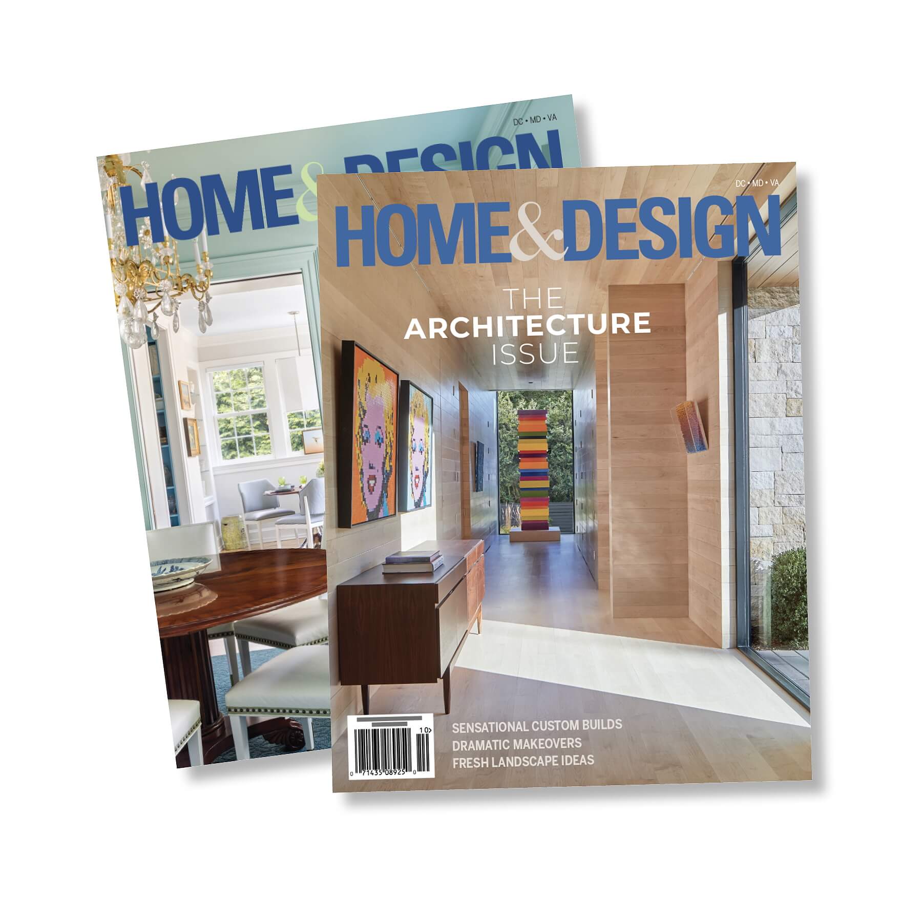
Published by Homestyles Media, Home & Design is a leading regional publication celebrating exceptional residential architecture, interiors, landscaping, and the people behind them. Its sister publication, Chesapeake Views, brings a similarly sophisticated editorial lens to homes, design, and life along the Chesapeake Bay.
Both titles have decades of editorial equity. When Therium became the new Art Director during the Summer of 2026, the opportunity wasn't to reinvent these established brands. It was to build on what was already working, steward the visual identity with care, and elevate the entire editorial experience—from the photoshoot to the printed page.

The Challenge
Therium inherited an established design system created and refined by a tenured art director. The publications already had a recognizable visual identity and a loyal readership. The challenge was to introduce a fresh creative perspective without disrupting the brand equity built over time.
At the same time, the publications demand an exceptionally high level of visual and production quality. Beautiful homes and interiors require beautiful storytelling—and that means more than placing great photography on a page. The visual story begins before the magazine layout: in how a home is photographed, which details are emphasized, how images are sequenced, and how the resulting story moves across the page.
The challenge was clear: evolve the experience without losing what makes the brand recognizable.
The Opportunity
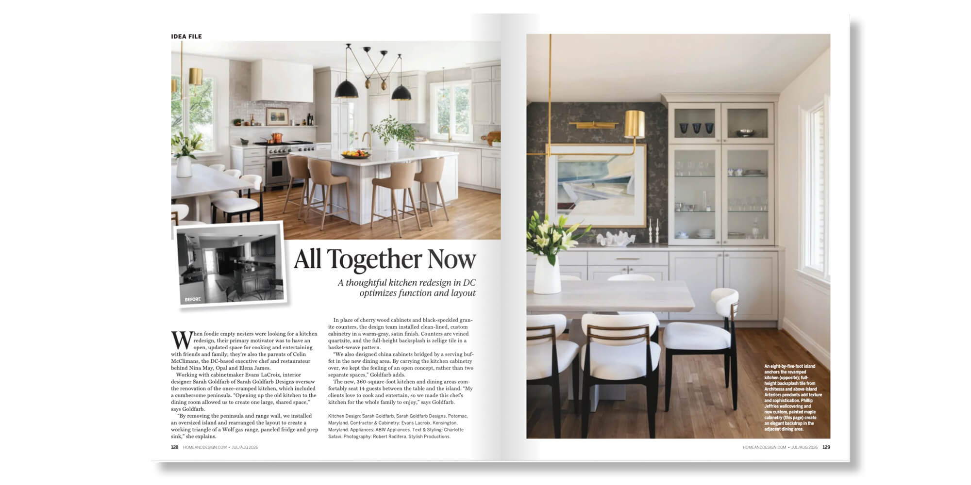
Rather than a traditional redesign, the role called for something more nuanced: elevating an established brand from within. That meant becoming both creative partner and brand steward—understanding the visual language readers already knew while identifying opportunities to make it sharper, more contemporary, and more sophisticated.
It also meant bringing together three disciplines rarely treated as one: editorial design, art direction, and production. Therium doesn’t simply design pages after editorial decisions have been made; our studio helps shape how stories are seen from the very beginning, art directing interior photography shoots and collaborating with photographers and editorial teams to identify the compositions, architectural details, and moments that will carry the strongest story. That thinking continues through image selection and sequencing, typography, visual pacing, color correction, prepress, and final production, with the story considered as a whole, rather than a series of disconnected steps.
The Strategy
The goal was to make an established brand better at what it already does exceptionally well. The approach unfolded across five fronts:
Stewardship First
The existing Home & Design visual language provided a strong foundation and a recognizable identity, so changes were made deliberately rather than disruptively. The design evolves issue by issue, preserving the visual cues readers know while creating room for a more contemporary editorial expression.
Art Direction Before the Shutter Clicks
For interior photography, Therium collaborates with photographers and the Homestyles Media editorial team to determine how each home should be visually experienced. Composition, angles, architectural features, styling, and small details are all considered with the eventual editorial story in mind — turning the photography into a foundational storytelling tool, not just documentation of a beautiful space.
Image Selection & Sequencing
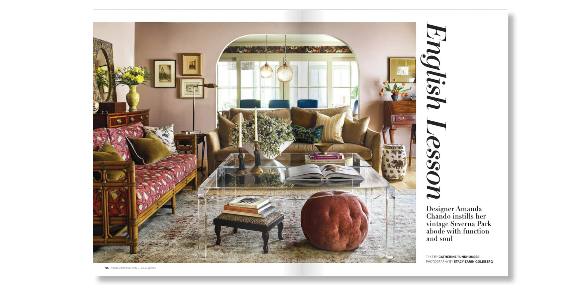
Once images arrive, photography and design work together. Images are selected and sequenced for their storytelling potential, visual impact, and relationship to the spaces being featured. Feature openers create moments of discovery, full-bleed photography provides immersion, and tighter sequences and detail shots reveal a home’s personality and craftsmanship.
Typography as an Editorial Tool
Therium introduced sleek, modern typefaces into feature stories, adding contrast, sophistication, and personality to the layouts. Rather than treating typography as a static brand element, type becomes an editorial tool — establishing hierarchy, creating rhythm, and giving individual stories their own visual voice while remaining part of a cohesive magazine experience.
Production as Creative Work
Color correction, image preparation, typography, prepress, and final production receive the same attention to detail as the design itself, with the objective of precision and consistency from first concept through finished magazine. For Chesapeake Views, this same approach is adapted to the publication’s distinct sense of place — sophisticated and connected to the Home & Design family, while allowing the character of the Chesapeake, its water, landscape, architecture, and lifestyle, to inform the editorial experience.
The result is evolution without disruption: a familiar brand with a sharper point of view.
The Results
Therium now guides the visual experience of two established publications, bringing a fresh design perspective while protecting the equity and recognition they have built over decades. For readers, that means publications that feel polished, contemporary, and visually engaging while remaining unmistakably Home & Design and Chesapeake Views. For photographers, designers, and editorial teams, it means a creative partner who considers the entire visual narrative—not simply the individual page.
And for Therium, it's an opportunity to demonstrate what thoughtful creative stewardship looks like in practice: respect the foundation, refine the system, and continually raise the bar. The best stewardship doesn't preserve a brand in amber. It keeps it moving.
It's a distinctly Therium approach: respect what has been built, identify what can be better, and make every issue stronger than the last.